Givelify: organization onboarding emails

For Givelify, 2022

An email sent to organizational users of Givelify, inviting them to make the first donation to their organization themselves

Givelify has two types of accounts: donors and organizations. As part of the onboarding process, we send organization users an invitation to make a small donation to their own organization as a way of helping them get involved with and invested in the process.

While the direction of this copy was largely dictated by marketing needs, transactional emails like this are considered during the UX and content design process. I reduced this copy for clarity and cognitive load (and to clarify the call to action). I also ensured that it met our brand guidelines and matched our style considerations.

Image text reads:

Are you excited? We are.

It’s your first day. Now for the first donation.

Hi [donor name]

Your account is ready for Givelify!

Your first donation could come anywhere—even yourself! Once those first couple donations are in, visit the free Givelify Analytics Studio to learn about your donations, donors, and how to increase both!

Give The First Gift

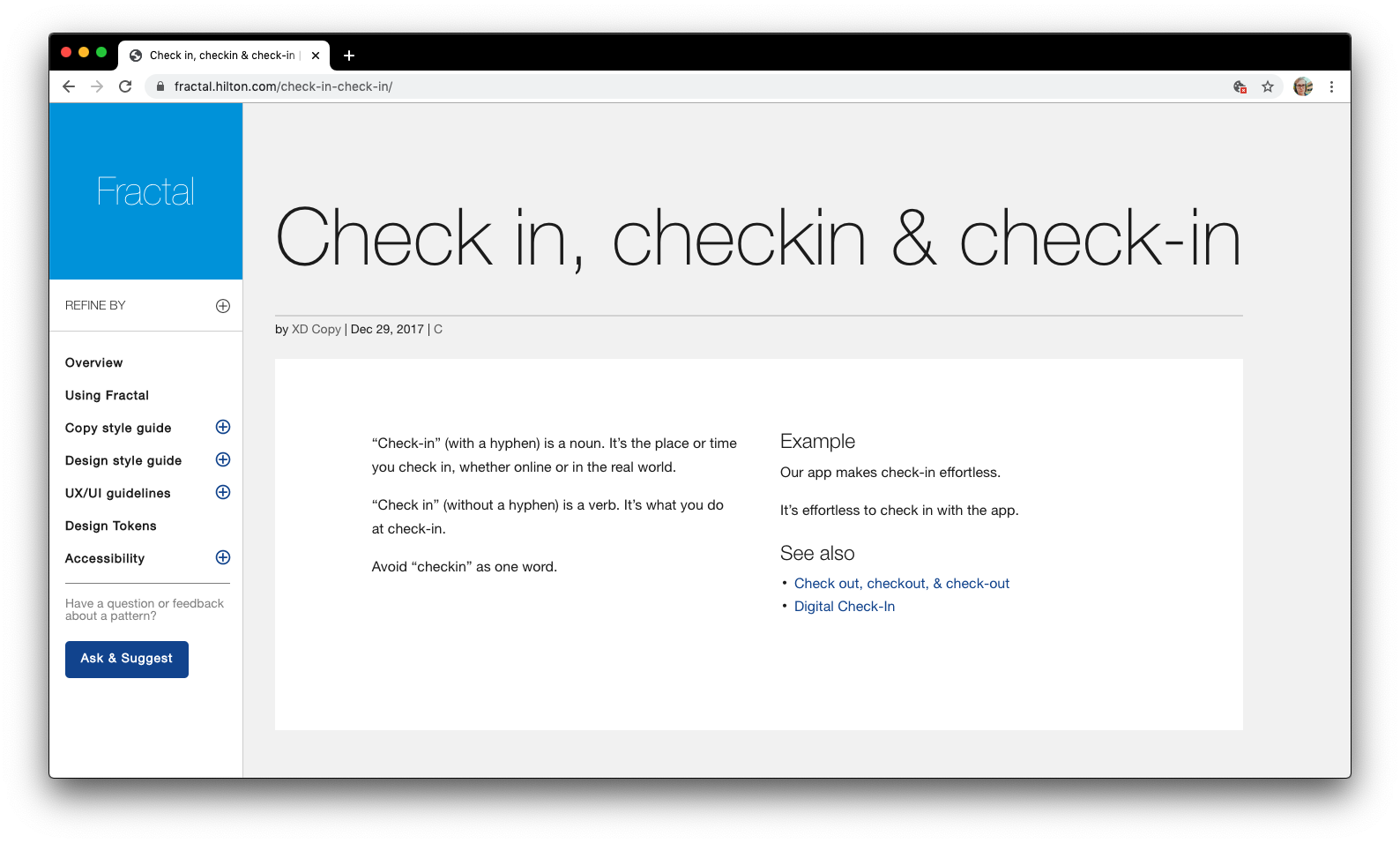
Fractal (Hilton XD's internal style guide)

For Hilton, 2018-2020

One of the most-referenced pages on Fractal covers a very important question for the hospitality industry.

One of the most-referenced pages on Fractal covers a very important question for the hospitality industry.

At Hilton, our copywriting team was spread across three cities on two continents, speaking two major variants of English (US and UK). We had a strong need to get on the same page with regard to the basics of spelling and mechanics.

While we already had an existing style guide, one of my first assignments was to review and update that guide. In 2018, I was tasked with a complete overhaul, bringing it online and incorporating it with Fractal, the style guide used by our user experience architects and designers.

I expanded and reorganized our guidance, and helped ensure consistency.

Browse the style guide for yourself.

Miramonte Indian Wells Resort & Spa

For Hilton, 2017

Miramonte Indian Wells Resort & Spa

When Miramonte resort & spa joined Hilton’s Curio collection of hotels and resorts, I was on the team tasked with revamping their online presence.

After an extensive content audit of their then-current content, we identified gaps in their available information, and I created new content to fill those holes.

I also edited existing content to bring it in line with Hilton’s tone of voice and style guidelines, updating everything from punctuation to breaking up sentences that might be confusing.

After all of that and an in-depth proofreading process, I also took on the responsibility of ensuring that all images had alt tags for accessibility, and that each page had a meta title and description that was useful for SEO, but remained friendly to human readers.

Their new site went live in 2017.

On Taste, Whatever The Hell That Even Is

A mid-length rant about "good taste" and how it's so often a synonym for "pretension." Which it shouldn't be. More than informal, it's roughly PG-13 in terms of language.

Madonna and Phillip Glass aren’t as far removed as I once thought. And neither is diametrically opposed to the Ramones or Glenn Branca or Fela Kuti. It’s just music. We don’t need it to live, but it’s goddamn music, man. It’s not the air we breathe, but the air is certainly a lot more interesting with it there.

I don’t care what you like. I don’t care if you like what I like, or if you like what the Spotify charts tell you. I only care that you like what moves you in some way. I don’t care if you like it enough, or as much as I do. Just like it. Have a good time. Dance if you wanna, cry if you gotta, just don’t let yourself get ripped off.

Read the whole thing on Medium.

Serge Gainsbourg Thinks You've Got a Lot of Nerve

A short, informal post on Medium.com about Serge Gainsbourg, and my favorite track by the 1960's French pop music legend.

"And that bass line. From the moment it kicks in, I’m taken to a space outside of time, occupied by that and the Beatles’ “Tomorrow Never Knows.” I’m not sure when or where it belongs; I don’t know of a time or place in the real world with that much style or nerve, but maybe we just haven’t gotten there yet.

"Once we do get there, maybe we won’t actually need to provoke people so badly, or we’ll at least take provocation with more grace and humor than we do now."

Read the whole thing on Medium.

Keyless Locks Blog Post, Magnetic Digital Agency

A particularly frustrating morning, and a week's experience with a couple gimmicky iPhone apps provided inspiration for this post I made to the Magnetic Digital Agency blog.

IS IT TIME TO GIVE SMARTPHONES THE KEY TO THE CITY?

I've been excited to see a new breed of locks designed to work around people like me, making our lives easier. These range from the keyless ignition in cars, which work from an RFID chip installed in the key or its fob, to the new app, Knock, which just keeps you from needing to plug in your computer password on newer Macs.

Like Knock, there's also the Goji smart home lock, and the Bitlock bike lock. All three are using the Bluetooth Low Energy protocol to - essentially - inform the lock that you're nearby and let you in without having to dig through your keychain - and they can let you loan access to certain people you choose.

Like any proud member of my generation, the one thing I very rarely forget is my phone. Even then, I'm not perfect - last night, I accidentally sent it home with a friend who gave me a ride to dinner. If I'd had these locks installed everywhere, I'm not sure I'd be able to recover - I was able to message my friend about the phone over Facebook, once I got into my house, because my roommate was home, and Knock still let me enter my computer password manually.

Read the full post here, if you'd like.

"One Weird Trick" Blog Post, Magnetic Digital Agency

A post, for Magnetic Digital Agency, about honesty in clickbait titles.

IT STARTED AS ONE WEIRD TRICK FOR SEO.

You've probably seen the "9 Out Of 10 Americans Are Completely Wrong About This Mind-Blowing Fact" post, which, while the teaser image is a shot of Morpheus and Neo from The Matrix, is all about economic disparity. I've also seen the same post on Buzzfeed with any number of other titles.

I'm not saying that we shouldn't talk about those things. I'm not saying that we can't write compelling headlines about them. I'm not even talking about my own reaction to the politics.

I am saying that if we want to talk about potentially divisive (or potentially boring) subjects, we shouldn't couch them in bland, non-descriptive titles. 9 out of 10 Americans could just as easily be wrong about economics as about whether the Platypus is the only mammal that lays eggs. (It's not; there's also the Echidna.)

While you might initially draw eyeballs to your post, it is dishonest to couch your content in terms that hide what's in store for the reader. And it certainly doesn't draw the eyes of people who are looking for what you have to offer.

Read the full post here. Or rant. Whatever you want to call it.

"Brain Hacks" Blog Post, Magnetic Digital Agency

One of my responsibilities as an employee at Magnetic Digital Agency was to write blog content for their new website. 

I wasn't given much more direction than that. As a result, when I was thinking about artificial synesthesia one day, this is what happened.

BRAIN HACKS TO BLOW YOUR MIND

When I was a kid, I associated songs with colors. I'm pretty sure the fact that "Stairway to Heaven" sounded tan to me was entirely due to the plaster-looking background on the Led Zeppelin IV album cover. However, I made a friend in middle school who had experiences that were harder to account for. 

This kid, when he was taking piano lessons, began to see colors with each note of the scales he had to practice. I tried to understand it as best I could - I thought maybe he was doing the same thing I do - maybe thinking about a picture or a music video when he played a song, but he was insistent: every note had a color, and he heard that note when he saw that color in a large enough swath.

He had synesthesia, a condition/ability that blends senses in a way that - quite honestly - I've always envied. 

[...]

Can the rest of us experience any of this? Can we hear colors or taste texture? 

It's well-known that smell plays a large part in our sense of taste, but certain foods, such as the sansho pepper, approach the gap between taste and touch. Sansho peppers do this by including a chemical that causes the tongue to feel as though it's experiencing a mild electrical current. The effect is eerily close to that of licking a 9-volt battery.

Read Full Article

"Apple Thinks the World is Flat" blog post, Magnetic Digital Agency

While working part-time at Magnetic Digital Agency, one of my tasks was to create content for the blog on their shiny new website.

Here's an excerpt from one:

"Apple Thinks the World is Flat: Here's Why We Agree."

Flat design allows Apple to more easily adapt their software's appearance to new applications. While the iWatch and the iCar are still mere rumors, Apple has made several changes to their screens' size and dimensions. 

Whether it was making the iPhone 5 taller than the iPhone 4S, or introducing the iPad and iPad mini, app developers have had to jump through several hoops to make their work look as good as possible on as many devices as possible. Flat design makes it easier.

This is a lesson we've learned, too, as web designers. More and more web traffic is coming from mobile devices - both smartphones and tablets - with more devices and screen resolutions appearing every day. 

Full Article

On Track in Memphis Press Release, 2009

The following is a sample of a press release about a temporary exhibit at the Pink Palace Museum in Memphis. I was tasked with the creation of this, in the interest of drumming up interest in a larger article from tourism publications. 

In a small town, a car waits at a stop sign while a train rattles by. Along the block-long downtown strip, customers gaze at their reflections in the shop windows. Elsewhere, a man sits on the edge of the loading dock of a warehouse, while his coworkers mill about and talk about football.

No one notices when a giant hand reaches down and snaps up a pickup truck to replace it with a semi truck. No one makes a move to help unload the fresh load. In fact, no one moves at all.

That's because this small town is truly small. It is, in fact, less than one percent of full size. That giant hand belongs to Ralph, and this intricately detailed town is his creation. Ralph didn't want to disclose his last name - he felt that credit should belong to Hugh Teaford, who heads up the Memphis Society of Model Railroaders, which presents "On Track in Memphis," a model train exhibit at the Pink Palace Museum.

At another table, Lee Hanna checks the tracks at a train yard and beams proudly when remembering how his grown son "knew his freight cars before he knew his primary colors."

The intensity of their pride in and love for model trains makes this exhibit something more than just a display of model trains. The care that clearly goes into every layout, every miniature building, and every tiny tree makes clear that this exhibit is an absolute labor of love.

When asked how much money has gone into the seemingly endless lengths of track on display at "On Track in Memphis," Hanna could only shake his head and say, "There is no way to measure that; it's just something we've built up and worked on for years."

Clyde Parke Circus Press Release, 2008

I worked at the Pink Palace in 2008-2009. While there, I was fortunate to witness the end of a two-year volunteer project to restore the Clyde Parke Miniature Circus to working order. The following is the beginning of a feature article I wrote for the Pink Palace Web site:

Clyde Parke began carving a miniature circus in 1930. In the midst of the Great Depression, Clyde Parke found himself jobless. To keep busy, Parke began carving a detailed model of a full three-ring circus at a scale of one inch for every foot.

As Parke's hobby turned to obsession, the Clyde Parke Circus as it exists today began to take shape. Over the course of 30 years, Parke fleshed out more and more pieces, and made the circus ever more elaborate. 

By the time he finished, the circus included more more than 2000 model people - almost 1,960 animated by a single one-half horsepower motor that drives the hand-built gears, belts, and pulleys  that make it all work.

But like all good things, that animated circus had to come to an end. One day, the gears just gave out. The Clyde Parke Circus parade had stopped in its tracks.